Case study · Brand Identity
Ankara Coffee & Eatery: A peacock line mark for a coffee and eatery brand
Logo design and signage concept in navy and gold
- Client
- Ankara Coffee & Eatery
- Year
- 2022
- Sector
- Food & Beverage
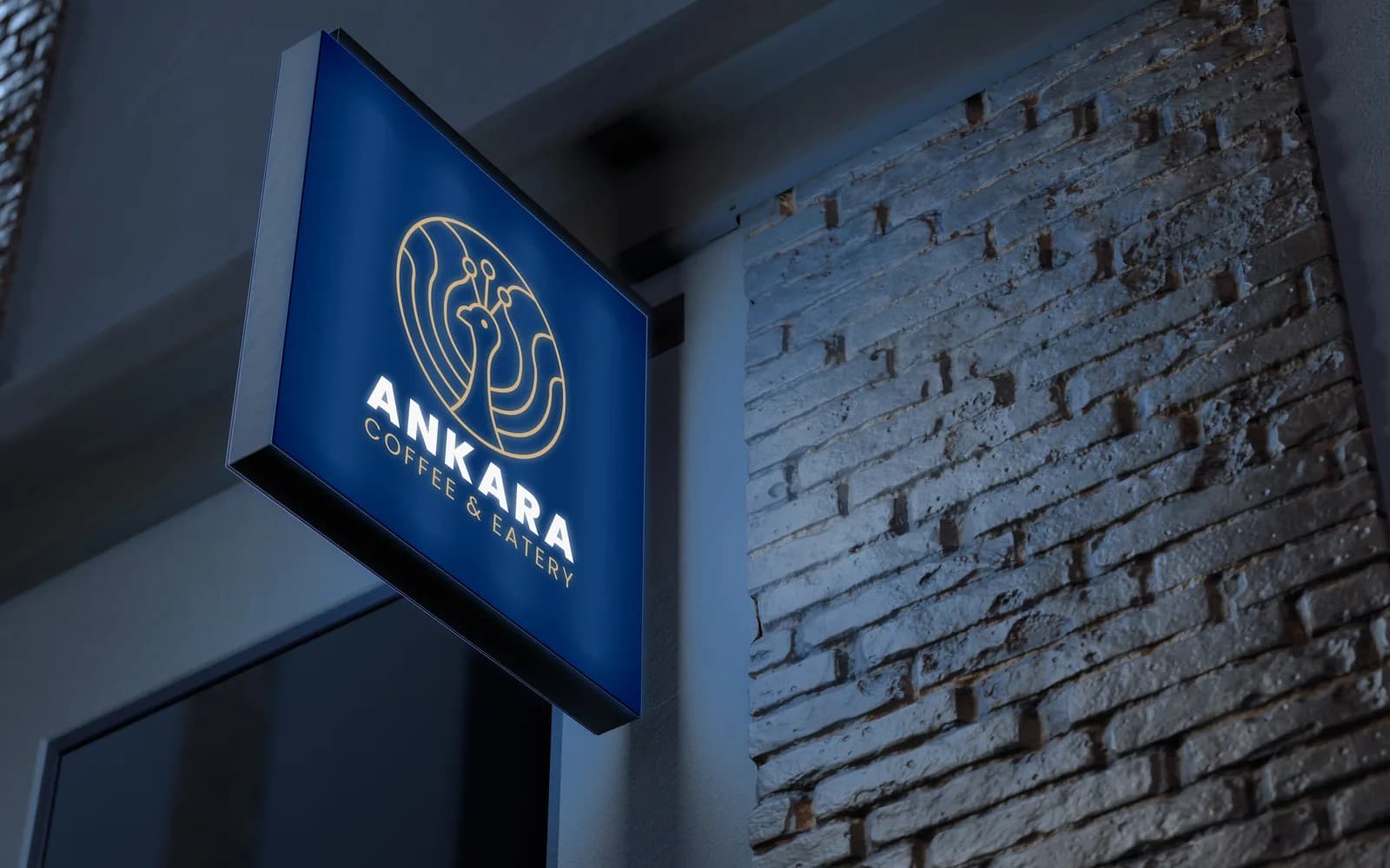
A brand mark for Ankara Coffee & Eatery: a peacock drawn in a single gold line inside a circle, with a light and a dark version and a wall sign concept.
Context
Ankara is a coffee shop and eatery that wanted a mark with a sense of craft and warmth, something that would look at home on a cup, a menu and a sign on a brick wall.
The challenge
Café logos are often either generic coffee cups or too detailed to print small. The mark needed character but had to stay clean enough for embossing, stickers and signage.
- A recognisable symbol, not a coffee cliché
- Works in one colour
- Strong on a dark storefront
Approach
How it came together.
- 01
Chose one continuous line
The peacock is drawn with even line weight inside a circle, which keeps it elegant and lets it be cut, embossed or printed in a single colour.
- 02
Set it in navy and gold
Navy gives a calm base and gold carries the line work, so the brand feels warm without relying on brown coffee tones.
- 03
Tested it on a real surface
A lit sign on a brick wall showed how the mark reads at night and from across the street.
Gallery
Brand mark
A peacock line mark in gold, set on navy for the dark version and on white for print.
What was delivered
- Primary logo
- Light and dark versions
- Wordmark lockup
- Signage concept
What changed
- The café has a mark that works from cups to storefront
- The single-line style is easy to reproduce with any printer