Case study · Web App
BioLife Personal: Body, lab and lifestyle data turned into one explainable health profile
Personal health web app that turns lab and body data into a 30-day plan
- Client
- Culturo Bio
- Year
- 2026
- Sector
- Health · Personal Wellness
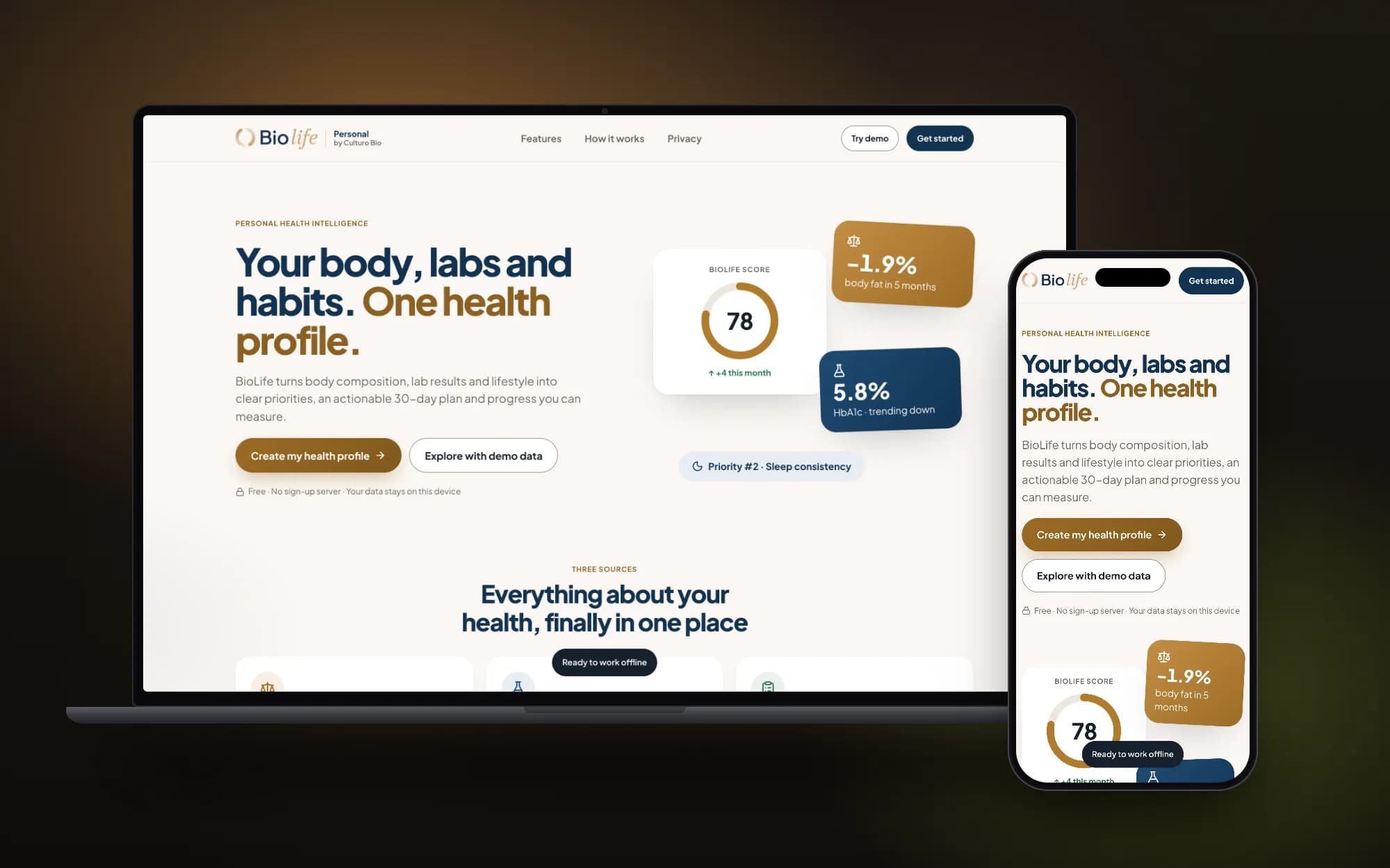
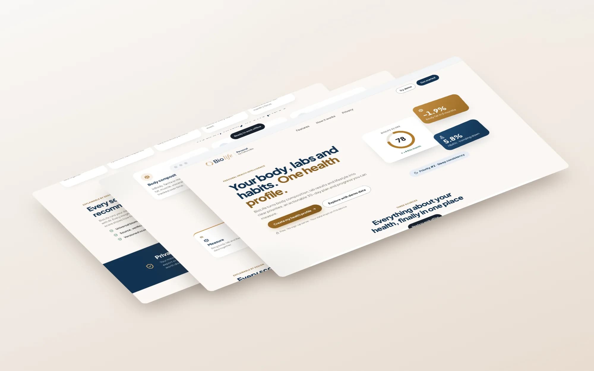
A personal health web app for Culturo Bio that brings body composition, lab results and a lifestyle questionnaire into one profile, with explained scores and a 30-day plan. The landing page leads straight into the app or into a demo mode.
Context
BioLife Personal is a consumer product from Culturo Bio, the physical wellbeing unit of Culturo Group, which works in personal diagnostics, lab services and health technology. It is aimed at individuals whose health data already sits in different places: a body composition scan from an InBody or Tanita scale, a lab report as a PDF or photo, and their own habits around food, sleep, activity and stress. Culturo Bio positions the product as wellness guidance, not medical diagnosis, and flags results worth discussing with a healthcare professional.
The challenge
Health data usually arrives in pieces: a body scan from one place, a lab PDF from another, and lifestyle habits that are never written down. Each source uses its own units and reference ranges, so people struggle to see what matters most or what to do next. Any tool that scores this data also has to earn trust, which means showing its reasoning and handling sensitive results with care. The product had to make the data useful without drifting into diagnosis.
- Three data sources in one profile
- Scores that explain their own reasoning
- A 30-day plan instead of a report
- Personal data kept in the browser
- Demo mode before any commitment
Approach
How it came together.
- 01
Framed the product around three data sources
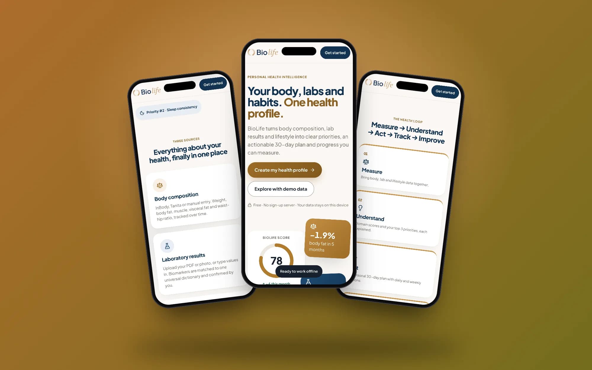
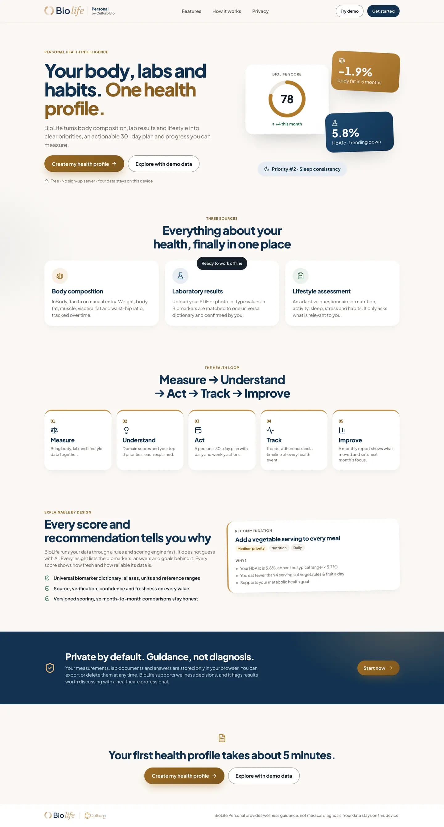
Body composition, laboratory results and lifestyle assessment each got a card on the landing page and its own way in: scale data or manual entry, a PDF or photo upload, and an adaptive questionnaire that only asks what is relevant. Naming the sources up front tells visitors exactly what to bring.
- 02
Structured the experience as a five-step health loop
Measure, Understand, Act, Track and Improve each map to a part of the product: domain scores with the top three priorities, a 30-day plan with daily and weekly actions, trend tracking, and a monthly report. The loop presents BioLife as a routine rather than a one-off test.
- 03
Chose rules-based scoring over AI guesswork
The page states that data runs through a rules and scoring engine first. Every recommendation card carries a "Why?" panel listing the biomarkers, answers and goals behind it, and every value shows its source, confidence and freshness. Versioned scoring keeps month-to-month comparisons consistent.
- 04
Kept personal data on the device
Measurements, lab documents and answers are stored only in the browser, with export and delete available at any time. That removed the need for a sign-up server and let the hero make a plain privacy promise directly under the main call to action.
- 05
Placed a demo path beside sign-up
"Explore with demo data" sits next to "Create my health profile" in both the hero and the closing section, so visitors can see a populated profile before entering their own numbers. The floating hero cards preview a score, a trend and a priority to show what the output looks like.
What was delivered
- Product landing page
- Body composition, lab and lifestyle input flows
- Explainable recommendation cards
- Five-step health loop section
- Demo mode with sample data
- Offline-ready app with on-device storage
What changed
- Culturo Bio can offer individuals a self-serve health profile without running a sign-up server
- Users can bring scattered health data into one place and see why each priority was chosen
- Anyone can explore a full profile in demo mode before sharing their own data
- The product states its limits clearly: guidance, with flags for results to discuss with a professional
Full page
Hover the window, or focus it with the keyboard, to scroll through the whole page. On touch screens, scroll inside it.
In a health product, explaining each score is part of the interface, and it shaped the design more than any visual choice.